Our final productions
|

|
In what ways does your media product use, develop or challenge forms and conventions of real media products?
9 frame analysis
I will select shots of our film trailer which show the use of existing conventions as well as examples of how we challenge and develop existing conventions.
Frame One
|

|

Double Jeprohdy
We have used some of the existing conventions from the start of the film Double Jeprohdy to help us portray the relationship between the protagonist and the 'princess'. Firstly we decided to use a close up two shot of both the characters looking at each other and looking happy. We felt that this would show the audience the characters are in love without saying it out loud. The second shot we took inspiration from was one of the two characters dancing together. This shows their romantic relationship and conveys happiness and love between the two characters. We have used these shots at the start of our trailer-the same as Double Jeprohdy. We felt this sets up an equilibrium for the start of the trailer and keeps the audience on edge.. We have used this existing convention as we felt it is successful in showing a happy relationship at the start of a trailer.
We have used some of the existing conventions from the start of the film Double Jeprohdy to help us portray the relationship between the protagonist and the 'princess'. Firstly we decided to use a close up two shot of both the characters looking at each other and looking happy. We felt that this would show the audience the characters are in love without saying it out loud. The second shot we took inspiration from was one of the two characters dancing together. This shows their romantic relationship and conveys happiness and love between the two characters. We have used these shots at the start of our trailer-the same as Double Jeprohdy. We felt this sets up an equilibrium for the start of the trailer and keeps the audience on edge.. We have used this existing convention as we felt it is successful in showing a happy relationship at the start of a trailer.

This close up two shot shows the relationship between the protagonist and the princess. This may be appealing for an audience as it could be relatable, due to the teenage romance theme.. Even for adult audiences, as it could remind them of their high school sweethearts. We have used the rule of thirds in this particular shot as we felt it was important for the audience to be paying attention to the two charaters in the shot, the middle third is blank however the heart on the wallpaper is an indicator of the two characters love and happiness.. At this point crime has not really been implied in the trailer apart from the director title screen. If we were to improve upon the trailer so far, i would suggest we implied much more crime into the mise-en-scene.. The shots of the two characters together tells the audience from the very first shot that the narrative will involve these two.
Frame Two
|
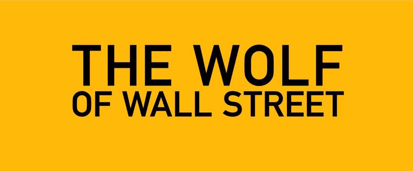
The Wolf of Wall Street
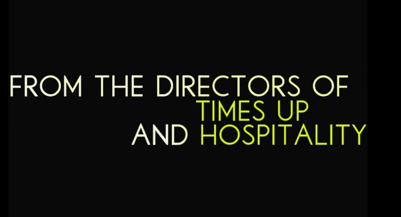
For our intertitles and institution screens we have used the colours black and yellow. These are colours often used in crime promotional material as they connotate police lights and police tape.. We have used these colours throughout the trailer from the intertitles, institutions, the title and even the billingblock. The contrast between the two colours attracts the attention of the audience and therefore makes the trailer seem more appealing than just black and white.
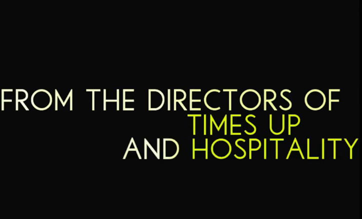
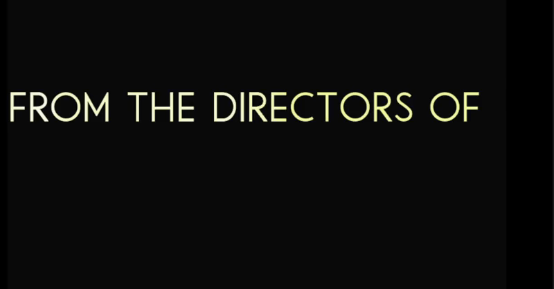
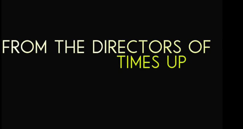
As shown to the left we have used director appeal for the very start of our trailer. 'Times up' and 'Hospitality' are projects we worked on last year in different groups. We felt this would start our trailer off with director appeal straight away with real products which relate back to us. We have used this convention with influence from The Wolf of Wall street as this was a very successful crime flim therefore it is worth taking notes from. We showed our director title screen at the start in stages, as shown below. We felt this would add more interest into the start of the film and make it appear much more arty and interesting.
|

|
|
|
Frame Three
We therefore developed the conventions used by Gone Girl to dress up the mise-en-scene of the missing persons appeal. We decided the mother character should be wearing plain clothes implying that she has no time to look after her appearence due to her daughter being missing. Her hair and make-up appear un-done. This again shows the distress and pure pain the mother is in. Due to the usual representation of women (especially in film) being looking 'picture perfect' i.e always having their hair and make-up done and wearing nice clothes. This represents mothers/women to be loving and caring in film, especially where they're children are concerned. Whereas there is no male appearence in this shot meaning that they could be shown to be not as able to show pain and to be able to connect emotionally to an audience for someone they care about. Stereotypically meaing women are more approachable in vunerable situations, as they are more conversational and better with words.
|
Gone Girl
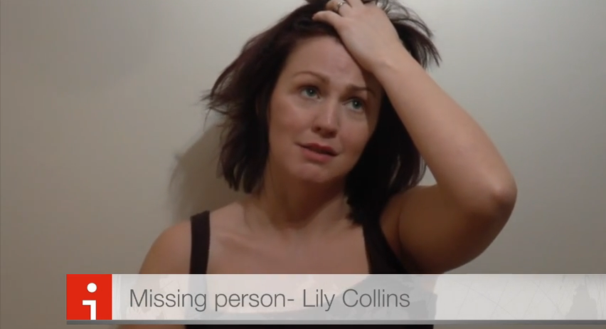
We have used a convention we had seen on the film Gone Girl's trailer as it had a similar narrative to our film. The convention used is that of a missing persons appeal of a mother speaking out the world. We have developed this shot as we felt the appearance of the mother was not very realistic. After thinking about the state of a real parent when loosing their child- we felt this shot on Gone Girl was not representative. 
We tried to keep this shot looking like home footage that is being broadcasted on the news. The originial plan was to have a news broadcaster introducing the clip saying "Here is the mother of Lily Collins as she appealed to the world using social media". However due to time deadlines we did not have chance to do this. Instead we put a news title along the bottom so the audience of the trailer knew it would be on the news. However, comparing our shot to the one from Gone Girl, I feel we have missed some details of a news broadcast such as 'LIVE'', 'BREAKING NEWS' and the name of the missing persons mother. This could have made our clip more realistic.
|
Frame Four
We felt that in order to convey a crime genre realisticly we should include an interview scene which allows the audience to take the side of whom they agree with througout the trailer and therefore the film. We took inspiration from the new film Nightcrawler which uses an interview scene near the end of the trailer. These shots are used to show the protagonist in Nightcrawler as vunerable and helpless. However we wanted to portray our protagonist as something slightly different.
|
|

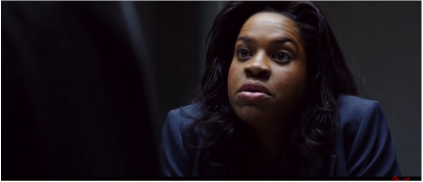
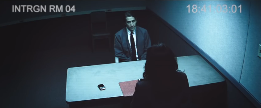
In our interview scene we have included the detective character as well as the main protagonist. We have tried to establish the detectives power in these shots. We have done this using low angle shots to show his authority and power over the protagonist. We have used conventions from Nightcrawler (2014) by using similar props (the papers that the detective has) as well as the table and two chairs in a plain room. It was important to use a room with no posters or decoration on as this would not be realistic as an interviewing room. However, we found a room which was acceptable which was actually called an interview room!

This shot shows the detective talking to the protagonist (MAX) about the crime that has been committed. He says he is "trying to help" in the dialogue however he doesn't want to really hear what Max has to say. This represents the police force as shot tempered and close minded. This may trasmit an ideology to an audience that the police force are unreasonable and don't really care about people who are trying to prove their innocence as detectives may see this as wasting police time or too much paperwork. This shows more of a crime genre as the police are a key aspect of crime.. The costume of the detective is much like a modern day detective. We felt this was appropriate as our films audience is teenagers and this is how they will recognise detectives (from a Touch of Frost, Midsomer Murders and other TV crime dramas). We have used the rule of thirds in this shot as well as this will help the audience to be drawn to the serious facial expression of the detective.
Frame Five
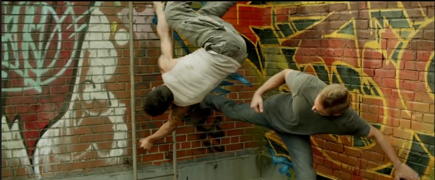

Brick Maisons
From this shot the brick wall in the background adds to the urban location of the film and adds to the crime with the graffitii. We took some inspiration from this trailer as we felt that the brick wall adds to the crime aspects as well as adding mysery. The chorography in this shot from Brick Maisons is not something we could really organise, so we decieded to use a closer medium shot of just the protagonist being hit-therefore causing amnesia. We have used the brick wall theme throughout our media packages as we feel this creates a nice synergy and adds to the crime genre. |
We put the protagonist in white to convey him as an innocent character type. We used the brick wall to use the conventions from Brick Maisons which helps to convey the genre of crime. The tattoos on the villans arm shows the representation of tattoos to be that of a 'thug' or 'baddy'. This shows the representation to the audience that it is bad to have tattoos, which may not be correct in all cases. We felt it was positive to include this shot in our trailer as it shows the protagonist to be a victim instead of an alledged offender.
We have made this shot look slightly darker as it was not filmed during the night. This was important to do as most crimes occur in the nighttime and again adds a mystery to the trailer and therefore the film which will appeal to its audiences. |
Frame Six

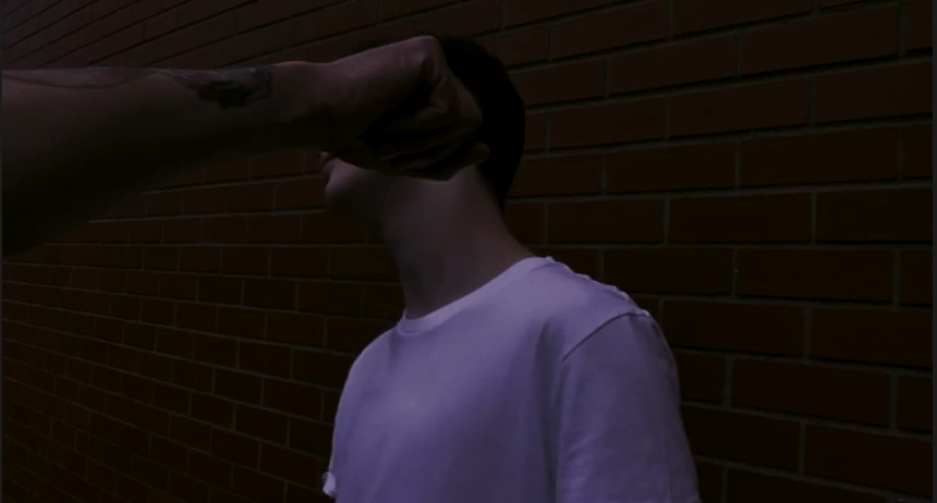
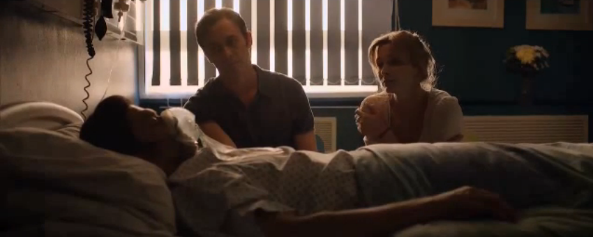
In our hospital scene, we have challenged some conventions of using hospital scenes in crime. We have shown the protagonist to be vunerable and confused througout the scene- which implies there is something not quite right. Whereas usually the 'damsel in distress' would be shown in this sort of situtation. This shows that we have challenged some conventional representations of character roles. We have dressed up the mise-en-scene to be as realistic as possible, by using bandgaes, tubes and a hospital gown. We also showed the doctors in white long coats which adds to the life like appeal. In the shot to the left we have included all props which are required to convey a hospital room and doctors. We have the charts which are used in the hospital as well as signs in the background which are conventionally used in these sorts of setting.s The costumes worn by the doctors are conventional to hospital scenes as they appear proffessional as the doctor to the left is shown wearing glasses, they both have seriours/stern facia;l expressions throughout the scene showing they are taking this patient seriously. Implying he has been in some trouble. This represents doctors to be helpful and thoughtful and that they take their jobs very seriously.
|

We have shown the protagonist to be on his own (no family or friends) in this shot to challenge usual conventions. Due to him being a suspect of his girlfriends disappearance we felt it was important that he was shown to be isolated and all on his own whilst he figures out what has happened to him.
|
Frame Seven
|
|
we have challenged conventions of typical trailers in our film as we have used clips where character break the fourth wall. This is not really used in trailers, however we felt it would be effective to use. We wanted to convey to the audience that everyone was against the protagonist in his life. His girlfriend, best friend and the detective are all involved in the fourth wall breaking. We have shown this to convey them speaking directly to him, putting the audience in his point-of-view. We feel this was effective as it shows the isolation of the protagonist even more and shows him to be all on his own with nobody on his side. This adds to the narrative by showing him to be guilty of kidnapping his girlfriend Lily.
|
Frame Eight

For our title screen we have used a brick wall again as the background which will create synergy for our other products as well as where the crime takes place. And we have used our house style colour of yellow. We darkened an existing image of a brick wall to add to the gritty genre of the film. We have used this existing convention of using the title to start of a montage sequence (or the third act). This allows the audience to remember the name of the flim whilst watching the most action packed and interesting part of the trailer- especially for young people. We have shown the full name of the title gradually which i feel gives a action packed atmosphere. It also goes in time to the non-diegetic sound which also appears effective.

|
|
Frame Nine

|
We edited some of the existing logos for the institution companies making them suit our trailers colour scheme. This created a continuous colour which made our trailer appear more of an institution itself with other companies incorporated with it.
|

We mainly used the film trailer for The Wolf of Wall street for hints at the conventional way for crime films to show insitituions and intertitles. As we already decieded on the main colours used to be black and yellow, we needed to look at the fonts used and how the colours are changed to fit with the trailer.
|
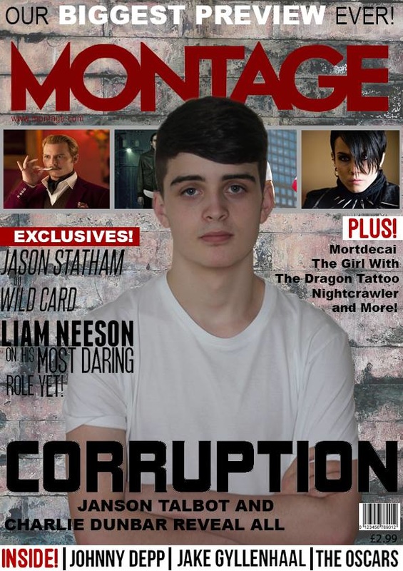
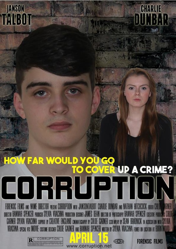
Poster and Magazine annotations
We have used some existing conventsion of magazine covers to ensure that our product looks realistic and like one which would be sold in a shop. We used inspiration from crime film magazine covers. As seen below.

|

|

Film Poster
|
We have used mainly existing conventions of other film posters for our film poster. We have tried to challenge some conventions by using two separate images in the foreground. As well as breaking the fourth wall with the characters in the images, we felt this will help the audience connect with the film and will therefore want to go and watch the film. |
|
How effective is the combination of your main product to ancillary texts?
Voice over script-
Narrative links.......
We have shown a narrative link between all of our media products to show them as one media product. We have shown the narrative to be the same throughout the products as we have used the main narrative story of the protagonist Max being accused of kidnapping his girlfriend. In the trailer. We have shown this in the trailer by showing Max being interviewed by a police detective about the disappearance of Lily. In the magazine cover we have shown this to be the narrative by the actors body language, he is positioned in a way which implies he is in trouble but wants to prove his innocent with a determined look on his face. Finally in our original film poster we used half of each of the two characters faces ripped up- this implied that they had something to hide. Whereas in our developed film poster we have used both characters again but with Max in front of Lily, This shows the narrative to be mysterious and full of crime.
We created genre in our promotional package using various conventions to make them evident. such as the use of the brick wall. We have used this somewhere in all of our media products. We decided to use the brick wall as we feel that it represents the product to be gritty and mysterious. We have also shown genre through colours used, we have tried to add a dark blue tint to some of the clips in our trailer as blue is often associated with the police and crime. However, mainly we have used yellow for all text we have used and some props in the mise-en-scene. We feel yellow represents the crime genre not as obviously as blue but we felt we could challenge this convention. By using yellow it makes the crime genre evident as well as appealing to a young target audience.
We created the representation that we did because we felt we should represent the location of the film to be dangerous and gritty. We have done this by using dark shots involving brick walls and fields- all things associated with the crime genre. We felt that if we could successfully represent the area to be quite rough the film would live up to its genre more clearly as well as being more interesting. We have also represented teenagers to be quite deviant as they are shown in the trailer to be drinking which some may consider wrong. This may convey to the audience that all teenagers are like this and the reason for crime being committed is down to alcohol. This may become an ideology due to the high profile role of the media. We have also represented the police force to be unhelpful and not really bothered about justice to the innocent.
In terms of media language, we have used a theme of close up shots as well as focusing on the two main protagonists which shows they are the most important people in the films promotional package. The close ups we have used of the protagonists faces are consistent throughout the promotional package have been used to all be similar so that the audiences find it easy to distinguish the 'Corruption' film from other crime films. They will recognise the characters and therefore feel a link with the film and feel they have more reason to watch the film.
We have decided that due to the content of our film trailer, poster and magazine cover our film. We had to consider this when we wanted to show the crime in our trailer. Due to the trailer being shown pre-watershed we could not show any distressing images or content, including blood and gore etc. According to the BBFC things that you would see in a rated 15 film include;
- strong violence
- frequent strong language (e.g. 'f***').
- portrayals of sexual activity
- strong verbal references to sex
- sexual nudity
- brief scenes of sexual violence or verbal references to sexual violence
- discriminatory language or behaviour
- drug taking
Voice-over justifying some decisions .
Synergy

Synergy can be defined as the interaction or cooperation of two or more organizations, substances, or other agents to produce a combined effect greater than the sum of their separate effects. Many media products use synergy in an attempt to create a fan base for their audiences so they can see the links for themselves from other media products within a media package. A good example of synergy, I feel would be the cornetto triology. Throughout all three films they have used a Cornetto as a synergy which creates a talking point among the audiences. For example, I had watched the first two films and only went to watch The Worlds End to see whether the cornetto would appear in the third film!
I feel that the largest use of synergy we have used would be the brick wall. We felt this was a good use of synergy as at the same time it connotates crime and portrays a crime genre. We have used this with the most important scenes. For example, the title screen in the trailer, the crime scene and the backgrounds for both the film poster and the magazine cover. However, they are not all in the same style, if we were to rethink our decision I feel we should have made all walls look more of the same.

|


|

|
What have you learnt from your audience feedback?
Magazine Cover


|
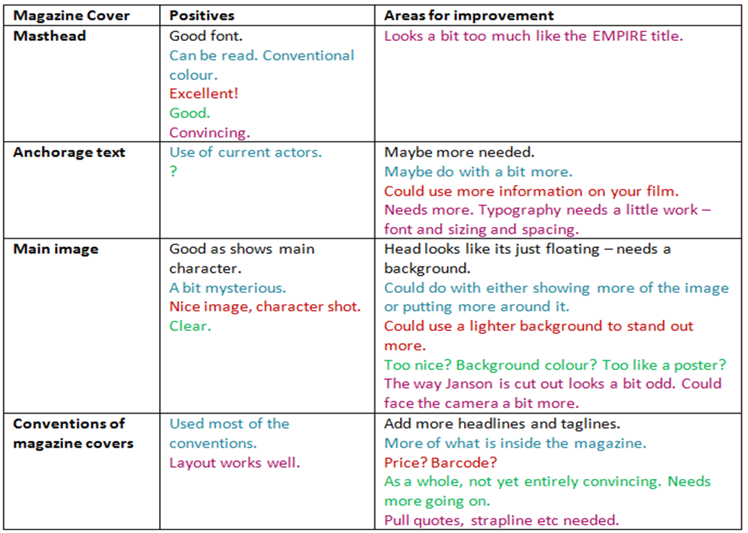
From our interim showcase we collect the information in the table above. We produced an action plan from these opinions. We were aware that much more work needed to be done to the magazine cover as due to unorganised time we were unable to spend enough time on the magazine cover.
The information collected helped us to recognise some issues with our first draft that we had not noticed before, such as the characters shirt blending into the background- some said it looked as if he was floating. It is evident from the first draft there is not enough pull quotes, or stories which would feature in the magazine. As shown to the left, it is evident that we changed quite a bit of our magazine cover for it to look more effective. We reshot the image for the centre of the magazine cover as we felt the one on the draft was not suitable for the final magazine cover. We also added some images onto the cover to add more of an appeal and make it more of a conventional magazine cover. We have added a background, which looks much more effective than just the black. We took into consideration the feedback given at the interim feedback- especially with the main image and anchorage text. As we felt this was extremely important to get right for a magazine cover. I feel that there is a massive difference between the original draft and the final product. The original lacked any appeal and if that was to be sold in the shop it would not be fetching very many sales. Whereas due to the appeal of the second cover, if we were to release this into the market it would be quite successful. |
Film Poster


Trailer |

To the left is our original version of our film poster, we showed this in the interim showcase. We used the idea of the characters faces being split into two for this idea as we felt it would represent the narrative well. However, it is evident from this and the magazine poster we had used a different typography for the title of our film- this is something that is really not conventional to a film promotional package. Therefore this was at the top of our list to fix. We then decided we needed some new images again as the costumes they were wearing are not really appropriate "I struggle to take the mickey mouse shirt seriously for a crime film". We felt this was a valid point and therefore decided to reshoot and put the characters in plain colour clothes which will therefore look more professional.
From the feedback we received about the typography we felt this was our priority as it was important for this to look effective, as the film poster would be seen a lot as part of a promotional package. It is evident from the developed film poster that the use of colour (yellow) some new images and correction of text, we had already made a large positive improvement upon our film poster. We created a billing block which could go onto the film poster as well as some institutional details which would both go right at the bottom. This was important as it is a key convention of film posters. Again, we have stuck to the colours black, yellow and white as we feel these are conventional for the type of film we are promoting. The positioning of the title is the same as we felt this is where it looks most appropriate. |
|
We encountered a problem whilst finalising the initial cut of Corruption, iMovie was turning some of the clips videoed on tape green and fuzzy. Thankfully, we overcame this problem for the final cut. This therefore meant that the audience of the interim showcase did not see every shot as parts were green and or fuzzy. 
|
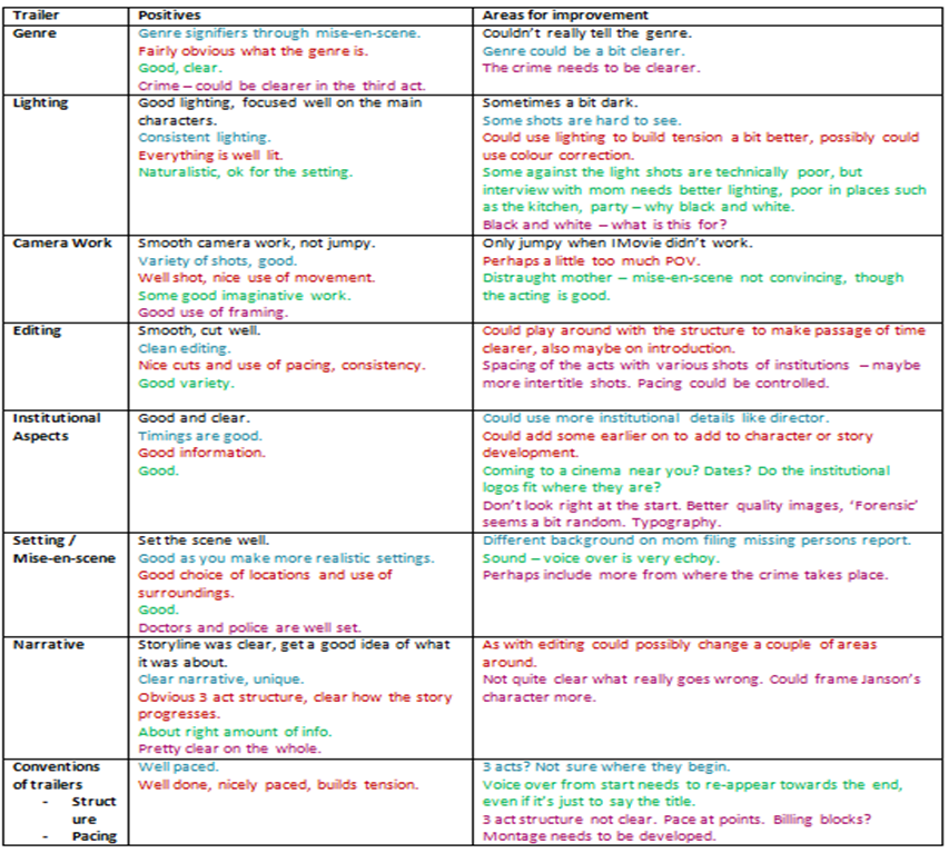
After our interim showcase, it was evident that we needed to do quite a bit of work to our trailer to make it the best it could possibly be. Some people said the genre wasn't quite evident enough, therefore we decided to add more hints into the trailer with a crime film. We did this using colour for the institutions and we decided to show the actual crime happening and not just stills of the aftermath. We changed the party scenes from black and white as it was apparently not obvious as to why they were in black and white, the aim of this was to show them as a flashback., We put the shots in normal again as we felt this looked just as effective and did not cause any confusion.
|
How did you use media technologies in the construction and research, planning and evaluation stages?
Throughout the duration of our media course, we have been directed to use different types of media technologies to help us conduct research, present information and show our own products. I feel this has been a benefit to us as it has helped us to find our tasks more interesting and appealing. Using different types of technologies is good way to appeal to a teenage audience especially when marketing a film. I feel if we had to design a promotion for our films e-media would have been a large part of the marketing due to our target audience being teenagers who would be interested in the internet and new technologies.
Research process

During the researching process, I have used a variety of sources in order to gather and present information. The internet is an obvious source of information (Google, Bing etc.). Specifically, we I have used sites such as IMDB. This webstie has helped me a lot throughout the research stages for our product. In order to find out more about crime films in particular it allowed me to search for films in that particular genre. For example, when searching for modern day crime films, I started with Nightcrawler, then IMDB suggested other films similar, meaning I could broaden my research further. Other websites such as Rotten Tomatoes allowed us to see audiences opinions of existing films so we could use this in our planning to use the positive aspects.
We have done a number of research tasks in order to get a real idea of the film genre and the conventions that come with it. Before the research tasks we did not know a lot about the crime genre in terms of media conventions. We conducted tasks such as iconography using a collage, watching documentaries on YouTube on the crime genre as well as hybrid genres such as film-noir and neo-crime films. This helped us to get a real idea of what we would be creating ourselves.
We have done a number of research tasks in order to get a real idea of the film genre and the conventions that come with it. Before the research tasks we did not know a lot about the crime genre in terms of media conventions. We conducted tasks such as iconography using a collage, watching documentaries on YouTube on the crime genre as well as hybrid genres such as film-noir and neo-crime films. This helped us to get a real idea of what we would be creating ourselves.
Planning process

During the planning process, I have used digital technologies such as different internet sources to help organise and plan information and ideas. I prefer Prezi, the presentation website. It is easy to use and presents information in a clear and easy to read way. There is different themes which help to present ideas in an interesting way which looks a lot better than just a page of writing.
We have also used the HD ready cameras available at school to film some test footage as well as focus groups and the group pitching our ideas to our target audience. We have used these cameras for the planning process as this got us ready to film our final trailer product with the same cameras- ensuring we were comfortable with the hardware we were using. We have also been using iMovie and Photoshop during the planning process to again practise our skills. We have produced mock ups for our magazine and film poster as well as putting together focus groups and a mini-documentary/game show. Whilst planning our media promotional package, we felt that getting used to using digital technologies such as the cameras and editing software was vital as this would make our final product more professional and look more appealing in general.
We have also used the HD ready cameras available at school to film some test footage as well as focus groups and the group pitching our ideas to our target audience. We have used these cameras for the planning process as this got us ready to film our final trailer product with the same cameras- ensuring we were comfortable with the hardware we were using. We have also been using iMovie and Photoshop during the planning process to again practise our skills. We have produced mock ups for our magazine and film poster as well as putting together focus groups and a mini-documentary/game show. Whilst planning our media promotional package, we felt that getting used to using digital technologies such as the cameras and editing software was vital as this would make our final product more professional and look more appealing in general.
Evaluation
In my evaluation tasks, I have used digital technologies such as Prezi to show step-by-step different conventions used for the film poster that we created. I have also used YouTube to show the decisions made to create a promotional package. I have done this to make the information on the evaluation page appear more interesting.
Trailer, Film poster and Magazine Cover
We have used mainly YouTube to advertise our film trailer using our media studies channel. We feel this was appropriate as it is a website platform which appeals to mainly our target audience of teenagers. We have used Photoshop to produce both the film poster and the magazine cover. We have used this as it is a user friendly software which is compatible with the Macs that we have used at school.
